

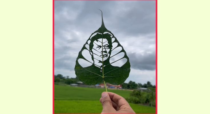
How to Create the Leaf Photo Effect: A Practical Editing Guide
You’ve probably scrolled past this one without knowing its name, a portrait where soft green or golden leaves frame the subject, sometimes drifting slightly out of focus in the foreground, giving the whole photo a natural, almost cinematic depth it wouldn’t have otherwise.
It’s become a genuinely popular editing style, largely because it works well across a wide range of photo types, portraits, product shots, even simple selfies, without needing a dramatic filter or heavy editing to pull off.
Here’s how it’s actually done, and more importantly, how to avoid the version that looks obviously pasted-on rather than genuinely part of the photo.
What the Leaf Effect Actually Is
At its core, this is an overlay technique. You take a base photo, then layer transparent leaf images (usually PNG files with no background) around or in front of the subject, adjusting blend settings so the leaves look like they’re genuinely part of the scene rather than stuck on top of it afterward. Done well, it adds a sense of depth and natural framing that a flat, unedited photo doesn’t have.
The effect works particularly well on portraits because the leaves can partially frame the face or shoulders, drawing the eye naturally toward the subject while adding visual texture around the edges of the photo.
Apps and Tools That Handle This Well
PicsArt
PicsArt has a large built-in library of overlay elements, including various leaf and foliage PNGs, along with blending mode controls that let you adjust how the overlay interacts with the base photo. It’s a strong starting point since you don’t need to source leaf images separately, everything’s built into the app already.
Canva
Canva’s photo editing tools, both the mobile app and web version, support layering and transparency adjustments well enough to pull this off, and it’s a good option if you’re already comfortable with Canva from other design work and don’t want to learn a new interface.
Adobe Lightroom Mobile
Better suited to the color grading and lighting side of this effect rather than the overlay itself. Once you’ve added leaf elements in another app, bringing the image into Lightroom to adjust warmth, contrast, and shadow detail is where a lot of the “cinematic” feel actually comes from.
Photopea (free, browser-based)
If you want Photoshop-level layer and blending control without paying for Photoshop, Photopea is a free, browser-based editor that replicates most of Photoshop’s core functionality, including proper layer blending modes, which matters a lot for this specific effect.
Step-by-Step: Getting a Natural-Looking Result
Start with a well-lit source photo. Natural daylight, ideally soft and directional rather than harsh overhead light, gives you the best base to blend leaves into convincingly. A photo with visible shadow direction also helps you match the leaf overlay’s shadows correctly later.
Choose leaf overlays that match your photo’s lighting and season. Warm, golden-toned leaves look out of place layered onto a photo clearly shot in bright, cool daylight, and vice versa. Consistency here does more for realism than people expect.
Position leaves at the edges and foreground, not directly over the face. The effect works best when leaves frame the subject rather than obscure it. A few soft, slightly blurred leaves in the foreground corners, with maybe one or two smaller elements elsewhere in frame, usually looks more natural than leaves scattered heavily across the whole image.
Use a blending mode instead of just placing the layer at full opacity. Modes like Soft Light, Overlay, or Screen (available in most editing apps under layer or blend options) let the leaf texture interact with the photo’s existing lighting and color rather than sitting on top of it as a flat, disconnected shape. Multiply mode works well specifically for darker, warmer-toned leaf overlays.
Reduce opacity until it looks intentional, not overwhelming. Full-opacity leaf overlays almost always look artificial. Dialing back to somewhere in the 40-70% range, adjusted by eye until it feels balanced, tends to look far more convincing.
Add a touch of blur to foreground leaves specifically. Leaves closest to the camera should be slightly out of focus if the subject is in sharp focus, mimicking how a real camera’s depth of field would naturally render foreground elements. Most editing apps include a manual blur or “depth” tool for this.
Finish with color grading across the whole image. Apply a consistent warmth or tone adjustment across both the original photo and the added leaves so everything reads as one cohesive shot rather than two separate elements pasted together.
Common Mistakes to Avoid
Too many leaves. It’s tempting to fill the frame, but a cluttered composition reads as busy rather than aesthetic. Restraint generally produces a more polished result.
Leaves that don’t match the photo’s light direction. If your subject is clearly lit from one side, leaf shadows and highlights inconsistent with that direction will look subtly wrong even if you can’t immediately identify why.
Overly saturated, neon-green leaf overlays. Natural, slightly muted greens (or warm autumn tones, depending on the mood you’re going for) look far more convincing than oversaturated colors that clash with the rest of the photo’s natural tones.
Skipping the blur step on foreground elements. A sharply focused leaf overlay sitting in front of a sharply focused subject looks flat rather than layered, missing the depth that makes this effect appealing in the first place.
The Bottom Line
This effect rewards a light touch far more than heavy editing. The most convincing versions usually involve just a handful of well-placed, properly blended leaves rather than an overloaded composition, with most of the actual “cinematic” feel coming from careful color grading and lighting consistency rather than the leaves themselves. Start simple, get the blending and lighting match right on one or two leaf elements, and only add more once that foundation genuinely looks convincing.
